Friday, November 20, 2009

Artist Book of the Hat of Dr. Suess

Dr. Suess, yes the famous Dr. Suess known for his crazy illustrations and children's books. In addition to that he created numerous prints and sculptures even. Currently there is a gallery on nicollet mall that is featuring him.

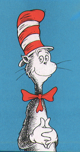
For my project the container will be a recreation of the hat from "The Cat in the Hat," this is because it is one of the most recognizable object of Dr.Suess's books.


The hat itself will be created by a metal-wire skeleton and material. The top of the hat in the picture will hold the actual pages of the book, while the bottom will hold cubes that resemble alphabet cubes (from when we were children), that will be engraved with illustrations of Suess. One cube will illustrate one story.
On top of this each stripe on the hat can folded over to showcase a print.

Sunday, October 25, 2009

Wedding designs, Formal designs, who cares? Me!


Alright for those that do not know, I personally love to design formal gowns and this passion came from seeing dresses from several designers, including the amazing Pnina Tornai. Her dresses are featured on "Say Yes to the Dress" on TLC, which is a show based on brides looking for that "O so perfect" wedding gown at Klienfelds.

Tornai's dresses are based on a certain sexual appeal, mixed with sparkle and shine, with a feminine feel; while they also come with a high price tag, one many of us can not afford. Tornai's own website (http://www.pninatornai.co.il/) says that the "dresses are hand made... with the principle of Haute Coture."(par 2)

There are two dresses that have won my heart over from the 2009 series. Here is the first dress.

It is from http://www.pninatornai.co.il/

This sweet heart design is based on the mermaid aesthetic, while using a textured material to give it the gentle and vulnerable touch. It is unusual that there is nothing sparkling on the gown, but this could be because it is not in front of us. The sexual appeal in this specific gown is not created through the lack of clothing, but through clothing. The gown itself contours to the figure, while creating an hour glass shape. What brings this gown over the edge is its simplicity, with the one bow at the hip and the small train.


The other dress that won me over is this dress:

It is from http://www.pninatornai.co.il/


In this dress, many can say it is what they expected from Tornai, in the fact it is bringing wedding dresses to its limits without it being costume like. There is the sexy corset full of (what seems to be) gems, that outlines the top of the breasts in a curvilinear form and is sprinkled throughout. The corset shows the woman's curves very well and is probably tied in the back. The skirt is like a ballroom skirt that has drank three monsters and has ate a whole bag of sugar; its just out of this world. Personally I can not imagine how much fabric or time went into making this skirt. At the bottom you can see what would may have been apart of a normal ballroom skirt, but you can see all these added parts that expand and are made of tulle.

The showcase of these designs was very smart. Both are based are on darker colors where the dresses can be showcased to there best ability. The first dress is in a simplistic room, where rectangular boxes and trim are used in the background and also to possibly express space. While the simplistic room, is similar to the dress in its simplicity, since the second dress is showcased with several more elements. The second dress is showcased in a room with a darker gray color on the walls, with chocolate brown and shades of that brown on the walls; this made the walls look a bit destroyed. On the walls are several frames of a yellow-off-white (nude) and dark brown. What is interesting is that all the colors including the dresses are neutral, yet the dresses stand out. Could this be because of texture, maybe.. Ok probably...

Saturday, October 10, 2009

The Walker Art Center.

All images are from the walkerart.org
Strong Formal

This Ellsworth Kelly painting really hit me and not for all the right reasons. But the painting is named the Black Curve as you can guess why. But I choose this for strong formal, because not only can the viewer see the positive and negative space easily, the black curve creates a strong form and shape. In the painting, it is so clear and concise where the black curve is because of the craft; it is as if a curvilinear line was extended into a form.


Strong Content

This is Tre ragazze alla balconata (Three Girls on a Balcony) by Michelangelo Pistoletto. I choose this image because the content is not just the mirror or the artwork it reflects it involves the mirror adding the viewer to the content. If you just see it without adding the reflection, it is three women from the 40s or 50s (I really do not know), looking out and watching some far and distant scene. But when you add in the reflection the women are staring at the future, at the viewer. Personally I love how the mirror reflects you and lets the women see you, it really brings a new sense and just sucks the viewer into the piece and adding. This means that each individual will have a different image to stand in front of.


Lacking Formal and Content

What can I saw, Ellsworth Kelly painted 3 big squares called Red Yellow Blue III copying the rainbow and put them up. There are no lines, no values, just color. That is correct I said it was just color; how can there be balance or unity when its just that red, blue, or yellow? Well I guess I can admit there is balance in the fact the 3 canvases are just one color and Kelly well he has great craft. While there is nothing to ponder, it is just 3 squares with one colored paint on each canvas. What this series bring up is what is really art work, is it determined by intent, by how one can ponder on an object?


Formal and Content Desired

This desired piece is Kiki by Chuck Close, which is desired because of the originality and wonder, while a reliance on abstract shapes. This seemingly formal portrait is created of small abstract colored shapes, that then construct implied shapes, color, and space; this creates the 3-d object, which in this case is a head. Not only that but the painting is that of a woman, who seems to be having a nonchalant moment and is just thinking; this allows the viewer to remember his or her times when they felt like that (hello day dreams, our teacher's worst nightmare). On top of all this the painting seems to be the one painting that mixes both postmodernism and modernism.


The WOW PIECE IF THERE WAS ONE, THE ITCH PIECE.. ECT+

While walking through the Walker there was nothing that sang to me or gave me the itch to do anything; I plainly just did not find anything very inspiring. Yes there were pieces I liked but it was not like when I saw a mixed media piece by Jim Dine that featured two images that depicted nudes with shells. During that situation my heart just pounded and it was like "o my gosh I need to find a way to incorporate some of those qualities in my work," well this just did not happen at the Walker. There are several possible reasons for this: A) I have a post modernistic view upon art and want there to be more to an image, than as Abbi said "paint" B) I still do not understand modern art and will fully admit it, since some of it can be so simple and so complex there is just no middle ground.. Seriously, after seeing a sheet with lights behind it, I think my mind just blanked .
So what I did was researched other art that the Walker has hosted. While completing the research I did find several pieces that I liked, but it was because they were not modernistic, including Untitled 10 by Melba Price. But then I came upon the Crouching Figure by Henri Gaudier-Brzeska.


Henri Gaudier-Brzeska's Crouching Figure did not have the same effect as that of Jim Dine's, but I still had a small flutter in my stomach. It was because of the symbolism used in the image, which came from the fetal image to the disturbance of the disproportion; I am even assuming the medium of the marble added some aspect of disturbance and vulnerability to the sculpture. By the fact we can see the woman with in the sculpture, personally allows me to connect to the sculpture. But this makes me wonder who is this woman, why is she like this, how did she get there, and why the artist depicted her this way; what was hit intent. Although at the moment I can only see the sculpture in the 2-d picture I do hope that one day I will be able to see it in real life.
Tuesday, September 29, 2009

Spring Time for Furtsenberg

Fashion Week has just passed us by, while one of the featured designers is Diane Von Furstenberg. A highly known designer for creating the wrap-dress!


Image is from http://blog.newsok.com/fashionmatters/

Video is from youtube.com


Furstenberg is renowned for her women’s fashion, while I do not know if this piece has a name, but by looking at the piece and seeing the video, we can see beads create the dress with a undergarment.


This specific garment does not seem to create a tight fitting form, but to show and exaggerate motion. When the model walks the beads move with her motion, that allows the viewer to see an undergarment, that is the exact same color of the beads. The main color of the garment at first glace seems to be blue and black; but, when analyzed, there are blue, mustard yellow, white, and black beads that compose the garment. What is interested the model is dark colored (No, I am not being racist), this skin color creates a contrast with the blue beads. The model wears a nude gold high heels, that are the same color as the mustard beads, while flowers seem to be in her hair showing a green and yellow. The bracelets on her arms are coordinated with her dress. In the dress unity is created through continuation of form, while balance is created through the repeated colors. I believe that Furstenberg was trying to create a garment that was high class, but maybe inspired by a tribe .


Why did the artist choose to use beads, make it so focused on movement, while considering it to be a spring piece. Personally I believe that there is a huge tie to tribal dresses of native cultures that inspired Furstenberg to create this design. This belief can be seen since many native cultures rely on beads to create exquisite colors, while using that long skinny form , that Furstenberg uses at the bottom of her garment to create movement. When I was a child I got to witness the Ojibwa tribe's traditional dances, where metal pieces would create movement and chimes .


Personally I enjoy this dress because it does have the movement and the colors remind me of a blue robin, while at the same time the dress seems to highlight the model extremely well. Part of the intent of a designer is to sell their design and Furstenberg has me hooked. While the only thing I would change about this look is the flowers in the hair and the bracelets’ the model wears. While the dress still sticks to a feministic aesthetic that is used in many of her designs, compared to that of a designer who is designing for a woman in a rock band .

Monday, September 28, 2009

The Midway

Surfing Through The Midway

    I went to the Midway with Sarah and had fun looking at images and depictions that I appreciated but did not really love and fully understand. Although like all art there is that one exception to the rule or belief; my exception, well it was Saul Fletcher's Untitled No.162-B.


Thanks to midwayart.org for the picture!


   Fletcher's Untitled C-Print is exciting and fun loving, with an exploding round rainbow sphere, that consumes around 2/3 of the print. On the opposing side there is a figure that wears a striped shirt and a hand in the pocket. The artist chose to feature the figure from the neck to the waist, not allowing any facial expressions to be read. Giving us a sense of mystery, what is that individual thinking? Why did the artist chose to feature the individual like that?


   This image was used twice to create the print, in the image seen above. Personally I believe balance is created through the use of the thirds rule that many photographers rely on, while the sphere is spread throughout many of the thirds created making it a main focus. Unity is created through the repetition of the shapes, especially in the sphere. But if you look closely there is unity through repetition all over, with the stripes and texture of the shirt to the many circles in the sphere .


    Untitled is made with excitement and adventure of the artist, through her use of color and exploration. Although age old concepts of form and content can be used to describe the image, there is a striking quality to the work that makes one stare .


The image for the following critique could not be found on the website so you must expierence midway to view!


   A sculpture that I could appreciate was Chiharu Shiota's Trauma. This depiction has strings are just all over; yet because of the chosen colors the figurine of the scared mother and child is still kept the main focus through the craziness. This depiction is encased in pexi glass, that Sarah is staring into.


   In this picture of the sculpture it is almost as if the figurine is terrified of Sarah. But with the image and title of the piece, I can assume that it is depicting a scene from a war, that the family is running from some one, or from the Hiroshima or Nagasaki bomb sites of the atomic bomb. If closely examined the figurine is leaning towards one way as if in movement, which is towards the viewer, engaging them. While the string is enveloping the figurine like that of a bomb or a suggestion of motion .

Sunday, September 20, 2009

Assigntment two- Mining the MIA


Images are from artsconnected.org and additional information can be found at an art set created at artsconnected.org click here to view.


Here is the example of the museum layout of the art that I would curate together. Personally what I was trying to see is what effect would occur if I put depictions of women from different cultures and times together. Afterwards I wanted to push it more by adding two focal depictions that also include men .


1st Image arts connected. As soon as an individual entered the door they would see Psych Abandoned by Augustin Pajou. This sculpture is an expressive and action filled sculpture of a nude, who is pained throughout her body language and facial expression. This being in the door sets a dark under tone upon the viewer. The dimensions are 2' 4" by 1' 1/2" by11 1/2" .


2nd Image arts connected. Although the example above is depression, the next is A Dancer Putting on Her Stock by Edgar Degas. This image is celebrating movement, while the depiction is not dealing with formality or currently identifying the figure, its like the gesture of sculpture; this is unlike the piece above which carries great proportion with the movement. When seeing the Psych Abandoned next to Degas' work a viewer could assume the show would be about feminism, a celebration of the female body, or a study of movement through the female body. The whole concept and tone is changed with this piece. Unlike the expressiveness of feelings in the piece above, this one shows very little especially since there is no face, hard movements, or strong suggestions of feeling. The dimensions are 1' 4 3/4" by 11 1/4" by 6 1/2" .


3rd Image in Arts Connect Ed. Portrait of Adele by Auguste Rodin is also a sculpture focused on emotion, movement and pose. Unlike Degas, Rodin depicted the nude with fine detail making everything smooth and descriptive. Once again the focus is movement and although the artists are different and from different times there is a unity between these first three images. Because of the way these past three sculptures of place there is that description of movement, if the 2nd sculpture had been removed there would have been a more expressed feeling; since, the way the Rodin placed the arms and head, there is the suggestion that the nude maybe crying or in anguish. Yet with the placement near the dancer we get the open feeling by seeing her chest and hips out, with the curve of her spine. Dimensions are 8" by 1' 5 5 5/8" by 7 3/4"


4th Image in artsconnected,,#40056 by Marscha Burns is a photograph, which is very different from the 3 above sculptures, but like the sculptures there is no color. Since it is a photograph, there is a huge amount of detail. This is the only 2d images giving it an importance in the set, although its placement is not in the center. While I believe that this progresses the feelings of above, while showing a placement of the nude. The details show the nude is getting ready to swim and stretching, while many of her muscles can be seen. Dimensions 8 5/8" by 5 9/16"


5th Image in artsconnected, is the Man and Women with a Cabalash. This is one of the oldest sculptures in the series, while it is from the Yuruba Tribe. The pair are moving the Cabalash (assumption that its the round object between the two), which like all the others gives a suggestion of movement. What changes is the perspective of the gallery, since this one depicts a male and is of orange color. When a viewer may have thought that the gallery was to appreciate the female it seems to appreciate movement suggested mainly through emotions, suggestion of actions and of the muscles. In scale this is one of the smallest pieces, making the importance on the piece seem different, since normally the largest pieces receive the most attention. The color of the sculpture contrasts so much to the others it would "pop." Yet the formality of the body is not as accurately depicted as the others, while there are more cultural suggestions. The cultural suggestions can allow us to place the figures like the last piece; while, we can also see there movement, which allows the audience to make similar connections that were made in #40056.Dimensions are 6" by 2 1/4".


Now I know there are extra images than the assignment of 3-5, but I would like YOU(anyone), thats right YOU(anyone), to tell me what you think these images do to the series!


The 6th image from artsconnected is Ganymede and the Eagle by Guiseppe Piamontini. Dimensions are 1' 6 1/2".


The 7th image is the Tiber Muse, while the artist is unkown. Dimensions are around 3' by 1' by 2".


The 8th image is The Figure of Bodhisattava.
Could not find the dimensions , but the scale is large, around my size in hieght and im 5'4".
This image is from flickr.


The 9th image is Eve with an Apple by Aristotlle Maillol
Dimensions are 22' 3/4" by 5" by8' 5/8"


Monday, September 14, 2009

Contemporary art, Assign 1


(image is from http://www.minnpost.com/artsarena/2009/04/24/8328/review_the_quick_and_the_dead_at_the_walker_plays_on_the_romantic_legacy_of_conceptual_art

Harold Edgerton's Atomic Bomb cicca, caught my attention, it is a gelatin silver print from 1952. As a viewer I can assume from the title that it is a real life depiction of the mushroom cloud of the atomic bomb. This assumption with the image, allows the us to realize what it is and why it looks the way it does, bringing even those who have just read of the event into the true story.
The image is striking and brings the eye around and into the form itself, like that of a
spiral, while holding its abstractness. At the left outside center of oval, that the cloud makes, there are lines suggestion that the cloud is enveloping its self; this personally reminds me of a shell. The contrast of the white and grays of the cloud and the deep black background creates amazing positive and negative space. Personally this deep contrast is an attribute I have always enjoyed in art.
Unfortunately because the cloud is so big, there is very little that can be seen, making it difficult for the viewer to imagine the full size and scale of the cloud; while, what is there is difficult to understand what it is ("it could be trees or bushes?).